
We Interrupt Your Regularly Scheduled Blog...
Just wanted to post a couple of links to some recent interviews over at Newsarama.com, one is an interview with me that's kind of a career overview, and the others are separate interviews with me, writer Scott Beatty and editor Ben Abernathy covering Number Of The Beast.
- Click HERE for the general interview with me
- Click HERE for an interview with NOTB editor Ben Abernathy
- Click HERE for an interview with NOTB writer Scott Beatty
- Click HERE for a NOTB Q&A with me
--C
Monday, February 18, 2008
Friday, February 15, 2008
Creating a Comic Book Page for
Number of the Beast - Part 3: Pencils

Pencil art for Number Of The Beast #1 pages 6 & 7; click on the image to see an
extra large version
Once the prep work is done(the thumbnails and layouts, covered in the last two posts), it's time for the fun stuff(at least for me), the pencil art, commonly called "the pencils" within the industry. All of the basic problems have been solved and all of the forms and guidelines are there in the finished layouts, and in this step I take that rough draft and turn it into (hopefully) clean rendering and good drawing.
I began the double-page spread above by taping two 11X17 pieces of company supplied Bristol Board paper together. Then I placed it directly on top of the layouts on the lightbox I have on my drafting table. This allowed me to "trace" over the layouts which were visible through the Bristol Board with the lightbox on. Below is a photo that shows what this looks like(although it's not the spread above, but a model sheet for the NOTB character Seafarer instead):
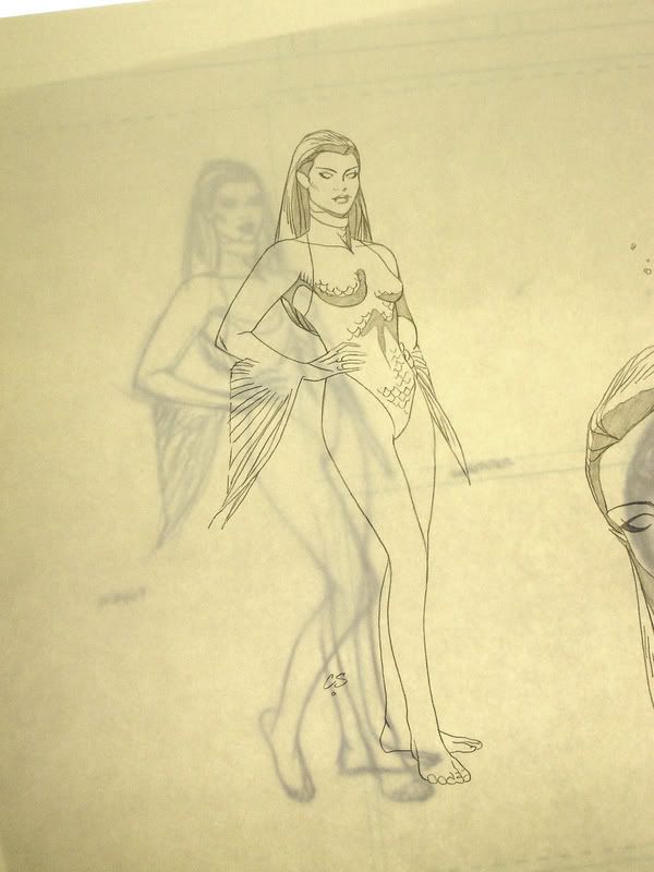
Looking through the pencils at the layout underneath on my lightbox
As you can see, the layout is clearly visible through the Bristol Board, but not terribly intrusive--I can see it just enough to use it as a guide(it's clearer in person than in this photo. but you get the idea). You can also see that in the Seafarer drawing I didn't strictly trace the layout--as I draw the finished pencils, I constantly change and tweak elements, adding final details shading and any lighting effects, sometimes changing entire figures and even entire panels. If you compare the spread at the top of this post with the layout version in the last post, you'll notice that the final panel with the flying saucers is completely different in the pencils.
Anyway, using the blue layouts as a guide, I rendered everything very tightly and as clearly as I could, finalizing all the elements in black lead. I used straight-edges for the buildings and ellipse templates for the saucers, but everything else was pretty much free-hand drawing. Not much else to describe process-wise, but I can say that this step was a pure joy to do--this two-page sequence turned out so much better than I had hoped. If I have the wall-space in a future studio, this one's going up in a big frame--that's how much I like it(and anyone who's ever heard me talk about my own work knows I don't say that very often)!
This is also the last step where I have any hands-on involvement. I box up my finished pencilled pages and FedEX them to Gaijin Studios in Atlanta , GA where inker Karl Story makes them look really good! I'll tell you as much as I can about that when I cover The Inks next time.
Tools/materials used in this step:
- 11"X17" 2-ply Bristol Board
- PaperMate PRO-Touch II mechanical pencil w/Pentel 0.5mm black lead
- PaperMate PRO-Touch II mechanical pencil w/Pentel 0.7mm H black lead
--C
NOTE: I forgot to mention all of the little "X"'s all over the pencil art above, and people outside of the business always ask about those. In order to save time and prevent carpal tunnel syndrome, most comic artists, myself included, label areas on the artwork that are supposed to be solid black with a little "X" or a bunch of "X"'s. I don't know how this practice started or who originated it, but it's pretty much standard. It also keeps the smudging and fingerprints to a minimum--if all the areas with "X"'s were filled in with black graphite, sheesh--smudge city by the time I'm done with it, let alone after an inker works on it! This will make more sense when you compare Karl's inked version of the spread(which I'll be posting next time) to the pencil version. One other note, I replaced the old smaller images of the layouts and pencils with extra-large versions today, so now you can see any details you may have missed in the initial jpegs.
Number of the Beast - Part 3: Pencils

Pencil art for Number Of The Beast #1 pages 6 & 7; click on the image to see an
extra large version
Once the prep work is done(the thumbnails and layouts, covered in the last two posts), it's time for the fun stuff(at least for me), the pencil art, commonly called "the pencils" within the industry. All of the basic problems have been solved and all of the forms and guidelines are there in the finished layouts, and in this step I take that rough draft and turn it into (hopefully) clean rendering and good drawing.
I began the double-page spread above by taping two 11X17 pieces of company supplied Bristol Board paper together. Then I placed it directly on top of the layouts on the lightbox I have on my drafting table. This allowed me to "trace" over the layouts which were visible through the Bristol Board with the lightbox on. Below is a photo that shows what this looks like(although it's not the spread above, but a model sheet for the NOTB character Seafarer instead):
Looking through the pencils at the layout underneath on my lightbox
As you can see, the layout is clearly visible through the Bristol Board, but not terribly intrusive--I can see it just enough to use it as a guide(it's clearer in person than in this photo. but you get the idea). You can also see that in the Seafarer drawing I didn't strictly trace the layout--as I draw the finished pencils, I constantly change and tweak elements, adding final details shading and any lighting effects, sometimes changing entire figures and even entire panels. If you compare the spread at the top of this post with the layout version in the last post, you'll notice that the final panel with the flying saucers is completely different in the pencils.
Anyway, using the blue layouts as a guide, I rendered everything very tightly and as clearly as I could, finalizing all the elements in black lead. I used straight-edges for the buildings and ellipse templates for the saucers, but everything else was pretty much free-hand drawing. Not much else to describe process-wise, but I can say that this step was a pure joy to do--this two-page sequence turned out so much better than I had hoped. If I have the wall-space in a future studio, this one's going up in a big frame--that's how much I like it(and anyone who's ever heard me talk about my own work knows I don't say that very often)!
This is also the last step where I have any hands-on involvement. I box up my finished pencilled pages and FedEX them to Gaijin Studios in Atlanta , GA where inker Karl Story makes them look really good! I'll tell you as much as I can about that when I cover The Inks next time.
Tools/materials used in this step:
- 11"X17" 2-ply Bristol Board
- PaperMate PRO-Touch II mechanical pencil w/Pentel 0.5mm black lead
- PaperMate PRO-Touch II mechanical pencil w/Pentel 0.7mm H black lead
--C
NOTE: I forgot to mention all of the little "X"'s all over the pencil art above, and people outside of the business always ask about those. In order to save time and prevent carpal tunnel syndrome, most comic artists, myself included, label areas on the artwork that are supposed to be solid black with a little "X" or a bunch of "X"'s. I don't know how this practice started or who originated it, but it's pretty much standard. It also keeps the smudging and fingerprints to a minimum--if all the areas with "X"'s were filled in with black graphite, sheesh--smudge city by the time I'm done with it, let alone after an inker works on it! This will make more sense when you compare Karl's inked version of the spread(which I'll be posting next time) to the pencil version. One other note, I replaced the old smaller images of the layouts and pencils with extra-large versions today, so now you can see any details you may have missed in the initial jpegs.
Thursday, February 07, 2008
Creating a Comic Book Page for
Number of the Beast - Part 2: Layouts

Layouts for Number of the Beast #1, pages 6 & 7; click on the image to see an
extra large version
Last time I described how I create a thumbnail sketch for a typical comic book page and how I arrived at the final design for what became pages 6 & 7 of Number of the Beast #1. This time I'll be concentrating on the next step, the layouts. The layouts are the most difficult and work-intensive part of the entire process, at least for me. The layouts are where I work out the anatomical structure of all of the figures and hash out all the backgrounds.
For these two pages, I began by roughing out Engine Joe in the large panel running across the top of the spread using a blue pencil. Then I drew a perspective grid for the background behind Joe, which--among other things--allowed me to accurately place everything else in the panel. For example, since Joe is about ten feet tall, maybe higher, I knew that any doors in the background would be shorter than his shoulders, and that if I drew a fireplug or something in the foreground it would only come up to a certain height somewhere around his shins or his knees. Once the perspective grid was down on paper, I tightened up Engine Joe's figure, getting all of the details in the correct places and the parts in the correct proportions. I usually bear down pretty hard when I draw, so the linework gets dark fairly quickly, and that makes it hard to see the lines I've put down in some places. Since there were still parts of Joe's figure that needed fussing over, I went in with black lead and did some more finalizing, which you can see most clearly on his right arm in the image above. Once Joe was in good shape, I moved on and used the same process on The Aeronaut, the flying hero above Engine Joe, and then on to the homeless man in the foreground. Next, I worked on the background buildings, but as usual, I left the backgrounds fairly loose since I've drawn hundreds of street scenes and was confident I could do most of the work in the next step(the finished pencils). If the script had called for a more complicated background, a recognizable building or something I've never drawn before, I would have been more precise here in the layouts. Once this large panel was done, I went through the entire process again for each of the remaining panels. As soon as I finished the layouts I knew this spread was going to work well. I couldn't wait to get to work on the finished pencils...which is part 3, and I'll cover that next time!
Tools/materials used in this step:
- 11"X17" copy/office paper
- PaperMate PRO-Touch II mechanical pencil w/Pentel 0.9mm blue lead
- Alvin Draftmatic mechanical pencil w/Pentel 0.9mm red lead
- PaperMate PRO-Touch II mechanical pencil w/Pentel 0.7mm H black lead
--C
Monday, February 04, 2008
Creating a Comic Book Page for
Number of the Beast - Part 1: Thumbnails
Actually the first part of creating a comic book page is the script, created by a writer in pretty much the same form as the script for a play or a movie. The script contains descriptions(sometimes brief, sometimes very detailed) of the characters, action and setting for every panel of every page of the story, along with the dialogue the characters will be speaking and any captions needed. In the case of Number of the Beast, the writer of the script is Scott Beatty. Unfortunately, I won't be showing any of Scott's actual script for the pages I'll be discussing on this blog because they give too much away about later plot developments we'd prefer to keep under wraps. What I'm going to begin with instead of the script are the thumbnail sketches. Thumbnails allow me to very quickly(by virtue of their size) work out the panel sizes, placement of figures and general flow of the story--and that's it. I don't worry about facial features, good perspective or precise rendering at this stage; that all starts in the next step, the layouts. In case anyone's wondering, they're called thumbnail sketches because they're traditionally drawn very small, about the size of a human thumbnail. The ones I do are in fact about the size of my entire hand--that's small enough for my purposes.
Below you'll find my initial thumbnail sketches for page 6 from Number of the Beast #1, the page where we finally get to really see our main characters for the first time. This page, as initially scripted by Scott, was supposed to be one large panel (this type of page is called a "splash page") showing four superheroes running down a city street at night. This page was also supposed to be the title page for the book, so it needed to have room not only for the drawings and dialogue balloons, but for titles and credits as well. The right part of the sketch below shows how the page was intended to look, with Engine Joe et al racing away from the reader deeper into the city-at-night setting. As soon as I drew it I knew it would never do--there was very little room for dialogue, titles, or credits, and it basically just lacked the dramatic "oomph" I felt the introduction of these larger-than-life characters called for. On the left side of the image below, you can see that I started playing around with showing the characters in profile, but this too left no room for any text and was still pretty dramatically boring.

Number of the Beast #1 page 6 thumbnail, take one
I took another try at the thumbnail, which you can see below, but this time I thought I could add some of that missing "oomph" by making page 6 part of a two-page spread with page 7. This attempt produced a slightly more dramatic page 6, and the sheer largeness of the two pages presented as one large image would add some impact, but it still wasn't quite working for me. I left it alone for a few hours and when I sat down to take another pass at the thumbnail, something clicked in my head and I saw the solution immediately. If you look closely at the top left of the image below(above the red writing), you'll see a thumbnail within a thumbnail, where I changed the entire layout of the two-page spread so that the top half would be a "widescreen" version of what was supposed to be page 6, with all of the little panels that were intended to make up page 7 spread from left to right on the bottom half of the spread. That was all I needed to go on to the next step, the above-mentioned "layouts," which is where the real drawing, as well as the hard work, begins...but that's going to have to wait until the next installment...

Number of the Beast #1, pages 6 & 7 thumbnails, take two(and take three at top left)
Tools/materials used in this step:
- 8.5"X11" copy/office paper
- PaperMate PRO-Touch II mechanical pencil w/Pentel 0.9mm blue lead
- Alvin Draftmatic mechanical pencil w/Pentel 0.9mm red lead
--C
Number of the Beast - Part 1: Thumbnails
Actually the first part of creating a comic book page is the script, created by a writer in pretty much the same form as the script for a play or a movie. The script contains descriptions(sometimes brief, sometimes very detailed) of the characters, action and setting for every panel of every page of the story, along with the dialogue the characters will be speaking and any captions needed. In the case of Number of the Beast, the writer of the script is Scott Beatty. Unfortunately, I won't be showing any of Scott's actual script for the pages I'll be discussing on this blog because they give too much away about later plot developments we'd prefer to keep under wraps. What I'm going to begin with instead of the script are the thumbnail sketches. Thumbnails allow me to very quickly(by virtue of their size) work out the panel sizes, placement of figures and general flow of the story--and that's it. I don't worry about facial features, good perspective or precise rendering at this stage; that all starts in the next step, the layouts. In case anyone's wondering, they're called thumbnail sketches because they're traditionally drawn very small, about the size of a human thumbnail. The ones I do are in fact about the size of my entire hand--that's small enough for my purposes.
Below you'll find my initial thumbnail sketches for page 6 from Number of the Beast #1, the page where we finally get to really see our main characters for the first time. This page, as initially scripted by Scott, was supposed to be one large panel (this type of page is called a "splash page") showing four superheroes running down a city street at night. This page was also supposed to be the title page for the book, so it needed to have room not only for the drawings and dialogue balloons, but for titles and credits as well. The right part of the sketch below shows how the page was intended to look, with Engine Joe et al racing away from the reader deeper into the city-at-night setting. As soon as I drew it I knew it would never do--there was very little room for dialogue, titles, or credits, and it basically just lacked the dramatic "oomph" I felt the introduction of these larger-than-life characters called for. On the left side of the image below, you can see that I started playing around with showing the characters in profile, but this too left no room for any text and was still pretty dramatically boring.
Number of the Beast #1 page 6 thumbnail, take one
I took another try at the thumbnail, which you can see below, but this time I thought I could add some of that missing "oomph" by making page 6 part of a two-page spread with page 7. This attempt produced a slightly more dramatic page 6, and the sheer largeness of the two pages presented as one large image would add some impact, but it still wasn't quite working for me. I left it alone for a few hours and when I sat down to take another pass at the thumbnail, something clicked in my head and I saw the solution immediately. If you look closely at the top left of the image below(above the red writing), you'll see a thumbnail within a thumbnail, where I changed the entire layout of the two-page spread so that the top half would be a "widescreen" version of what was supposed to be page 6, with all of the little panels that were intended to make up page 7 spread from left to right on the bottom half of the spread. That was all I needed to go on to the next step, the above-mentioned "layouts," which is where the real drawing, as well as the hard work, begins...but that's going to have to wait until the next installment...
Number of the Beast #1, pages 6 & 7 thumbnails, take two(and take three at top left)
Tools/materials used in this step:
- 8.5"X11" copy/office paper
- PaperMate PRO-Touch II mechanical pencil w/Pentel 0.9mm blue lead
- Alvin Draftmatic mechanical pencil w/Pentel 0.9mm red lead
--C
Sunday, February 03, 2008
NOTB Sketchbook Gallery 3
Next time I'll begin a step-by-step look at the creation of a page from Number of the Beast from thumbnail stage through to the finished lettered/colored product. For now, though, while I gather the materials for that post together and get more work done, here are two more NOTB character sketches...


--C
Next time I'll begin a step-by-step look at the creation of a page from Number of the Beast from thumbnail stage through to the finished lettered/colored product. For now, though, while I gather the materials for that post together and get more work done, here are two more NOTB character sketches...
--C
Subscribe to:
Posts (Atom)