
Number of the Beast - Part 3: Pencils

Pencil art for Number Of The Beast #1 pages 6 & 7; click on the image to see an
extra large version
Once the prep work is done(the thumbnails and layouts, covered in the last two posts), it's time for the fun stuff(at least for me), the pencil art, commonly called "the pencils" within the industry. All of the basic problems have been solved and all of the forms and guidelines are there in the finished layouts, and in this step I take that rough draft and turn it into (hopefully) clean rendering and good drawing.
I began the double-page spread above by taping two 11X17 pieces of company supplied Bristol Board paper together. Then I placed it directly on top of the layouts on the lightbox I have on my drafting table. This allowed me to "trace" over the layouts which were visible through the Bristol Board with the lightbox on. Below is a photo that shows what this looks like(although it's not the spread above, but a model sheet for the NOTB character Seafarer instead):
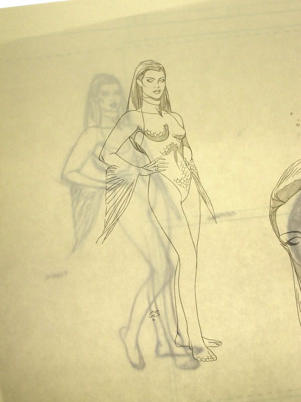
Looking through the pencils at the layout underneath on my lightbox
As you can see, the layout is clearly visible through the Bristol Board, but not terribly intrusive--I can see it just enough to use it as a guide(it's clearer in person than in this photo. but you get the idea). You can also see that in the Seafarer drawing I didn't strictly trace the layout--as I draw the finished pencils, I constantly change and tweak elements, adding final details shading and any lighting effects, sometimes changing entire figures and even entire panels. If you compare the spread at the top of this post with the layout version in the last post, you'll notice that the final panel with the flying saucers is completely different in the pencils.
Anyway, using the blue layouts as a guide, I rendered everything very tightly and as clearly as I could, finalizing all the elements in black lead. I used straight-edges for the buildings and ellipse templates for the saucers, but everything else was pretty much free-hand drawing. Not much else to describe process-wise, but I can say that this step was a pure joy to do--this two-page sequence turned out so much better than I had hoped. If I have the wall-space in a future studio, this one's going up in a big frame--that's how much I like it(and anyone who's ever heard me talk about my own work knows I don't say that very often)!
This is also the last step where I have any hands-on involvement. I box up my finished pencilled pages and FedEX them to Gaijin Studios in Atlanta , GA where inker Karl Story makes them look really good! I'll tell you as much as I can about that when I cover The Inks next time.
Tools/materials used in this step:
- 11"X17" 2-ply Bristol Board
- PaperMate PRO-Touch II mechanical pencil w/Pentel 0.5mm black lead
- PaperMate PRO-Touch II mechanical pencil w/Pentel 0.7mm H black lead
--C
NOTE: I forgot to mention all of the little "X"'s all over the pencil art above, and people outside of the business always ask about those. In order to save time and prevent carpal tunnel syndrome, most comic artists, myself included, label areas on the artwork that are supposed to be solid black with a little "X" or a bunch of "X"'s. I don't know how this practice started or who originated it, but it's pretty much standard. It also keeps the smudging and fingerprints to a minimum--if all the areas with "X"'s were filled in with black graphite, sheesh--smudge city by the time I'm done with it, let alone after an inker works on it! This will make more sense when you compare Karl's inked version of the spread(which I'll be posting next time) to the pencil version. One other note, I replaced the old smaller images of the layouts and pencils with extra-large versions today, so now you can see any details you may have missed in the initial jpegs.

3 comments:
Man, you're no nonsense linework just slays me.
How is it that Karl gets such dense blacks? He and Golden's inks look impossibly like photostats?
=s=
Man, it's great to not only know that your incredible artwork will finally have a home post Midnighter, but we're also being treated to a peek behind the curtain at your creative process!!
Speaking of your layouts; I still have one of your Tom Strong layouts from the Telsa Strong special framed and on the wall of my studio- a constant source of inspiration and joy, to be certain.
Looking forward to NOTB like you can't believe!! :-D
hey there Chris, I'm so stoked to have found your blog....BIG FAN. have been since the Batman annual, Splinter of the Minds Eye was the first paperback book i remember reading as a kid, seeing you and Terry do the adaption all those years later was really something special and Tom Strong is the BEST COMIC EVER!!!!! loved it, hope it comes back some day. This series of behind the scenes are wonderful, what a great insight into your method. Take care Chris, I'll be checking in regularly for all the upcoming goodness, a big fan, Dusty Abell.
http://dusty-abell.deviantart.com/
Post a Comment