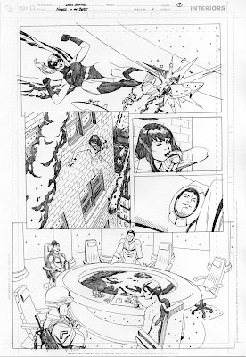
I thought it would be a good idea to butt into the series on the making of a page from Number Of The Beast in order to let interested people know that the most current Wildstorm comics (cover dated April 08) contain a NOTB preview! The preview is seven pages long and features the cover and six fully finished pages from the first issue.

The pencil artwork for page 9 of Number Of The Beast #1,
just one of the pages featured in the preview
--C


5 comments:
This page is an excellent showcasing of your mechanical drawing skills. Do you use a french curve or something to help with all the clean splines you have?
Thanks! The only french curve use on this page was on the large saucer hull in panel 1. Straight lines were drawn with the aid of a straight edge, obviously. Everything else you see was drawn free-hand. Well, I did cheat a little with the table in the bottom panel--I scanned in the layout for that panel and created the ellipses of the table(in perspective) using Photoshop, then traced a printout of the table for the final drawing. Sounds complicated, but it was actually easier and far faster than it would have been if I tried to free-hand the ellipses with a less precise under-drawing. I still managed to screw up the base of the table, though, even with the help of computer generated shapes. Actually, as I look back on this page, I realize it's a good showcase of how I use the computer and Photoshop to enhance my work. In the bottom panel, the image of the character Wallflower's face in the center of the table was accomplished by taking a scan of her face(a head-on shot) from the model sheet and stretching it into the correct perspective, then applying ripple and wave effects. Again, I traced a printout of the Photoshopped face for the final pencils. I started doing this with the viewscreen images in Ocean(stretching simple head-on shots into perspective) and have done it many, many times in NOTB. It's faster and looks more accurate than when I've tried to accomplish the same effect without the assistance of a computer. Hope this doesn't ruin the illusion!
your pencils are so much fun to see, karl's inks are amazing but i'm getting the biggest kick out of seeing the work before hand. have you used photoshop to lay highrise building windows into your cityscape shots in perspective yet? just build one window treatment, cornices, frames, ledges-and just keep duplicating until you have twenty stories of window, bang, slap em right on your building face, mas time saver!
This page looks great! I love the clarity and energy in your work. Looking forward to this book so much!
Ah, very much looking forward to this series, Chris! Thanks for the sneak-peaks and info.
Post a Comment